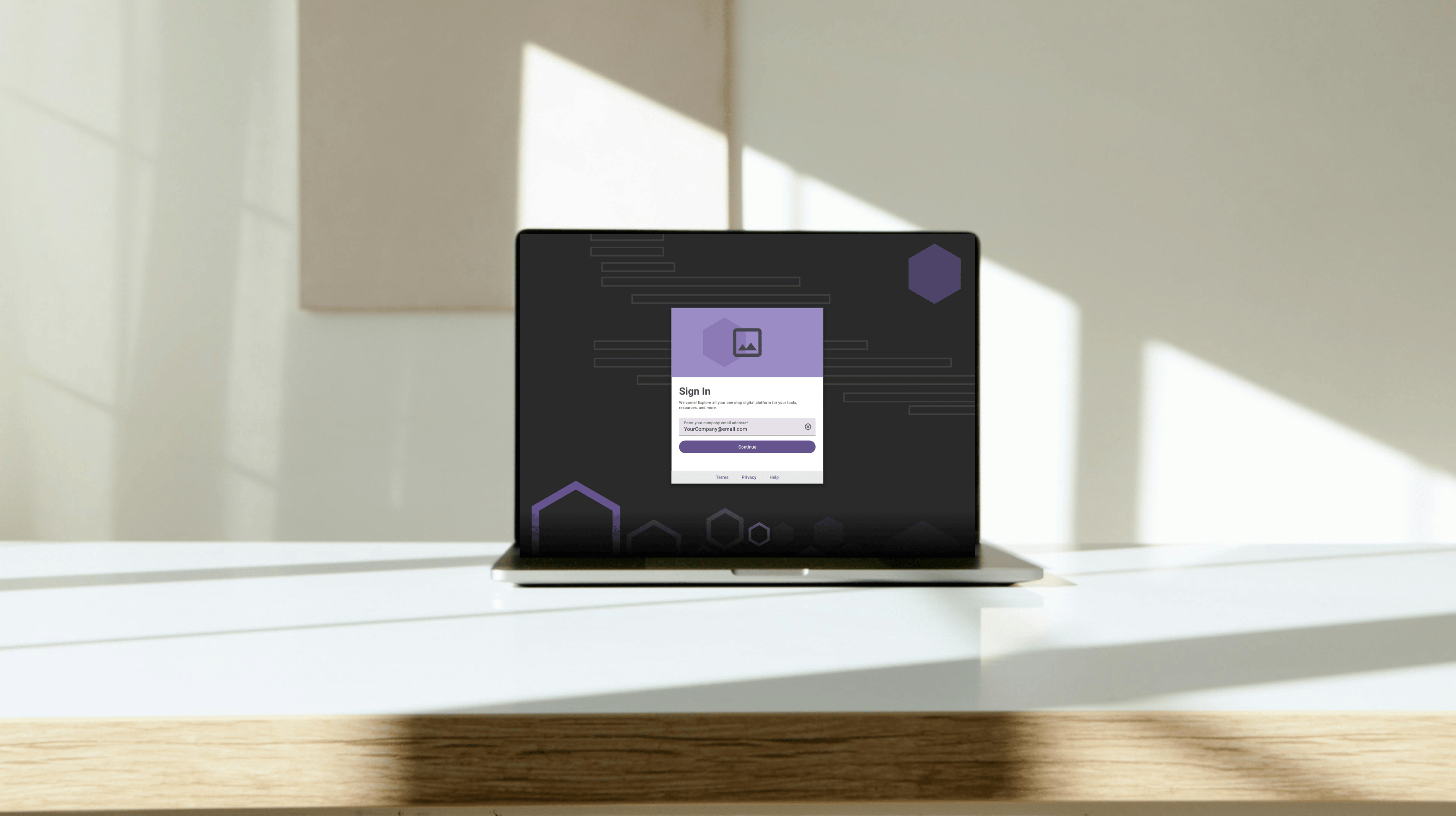
Authentication Redesign
Streamlining Sign-In: A UX Overhaul for Faster, Easier Access
Responsibilities
UX Strategy, User Research, Interaction Design, Cross-Functional Collaboration, Usability Testing
Product
Authentication experience that routes users seamlessly through the login flow.
Team
1 Designer
1 Product Owner
3 Developers
I led the UX redesign of a high-traffic internal sign-in page that was confusing users, increasing login failures, and slowing down access to the portal. My goal was to simplify the experience while accommodating two different user types, without compromising security or clarity.
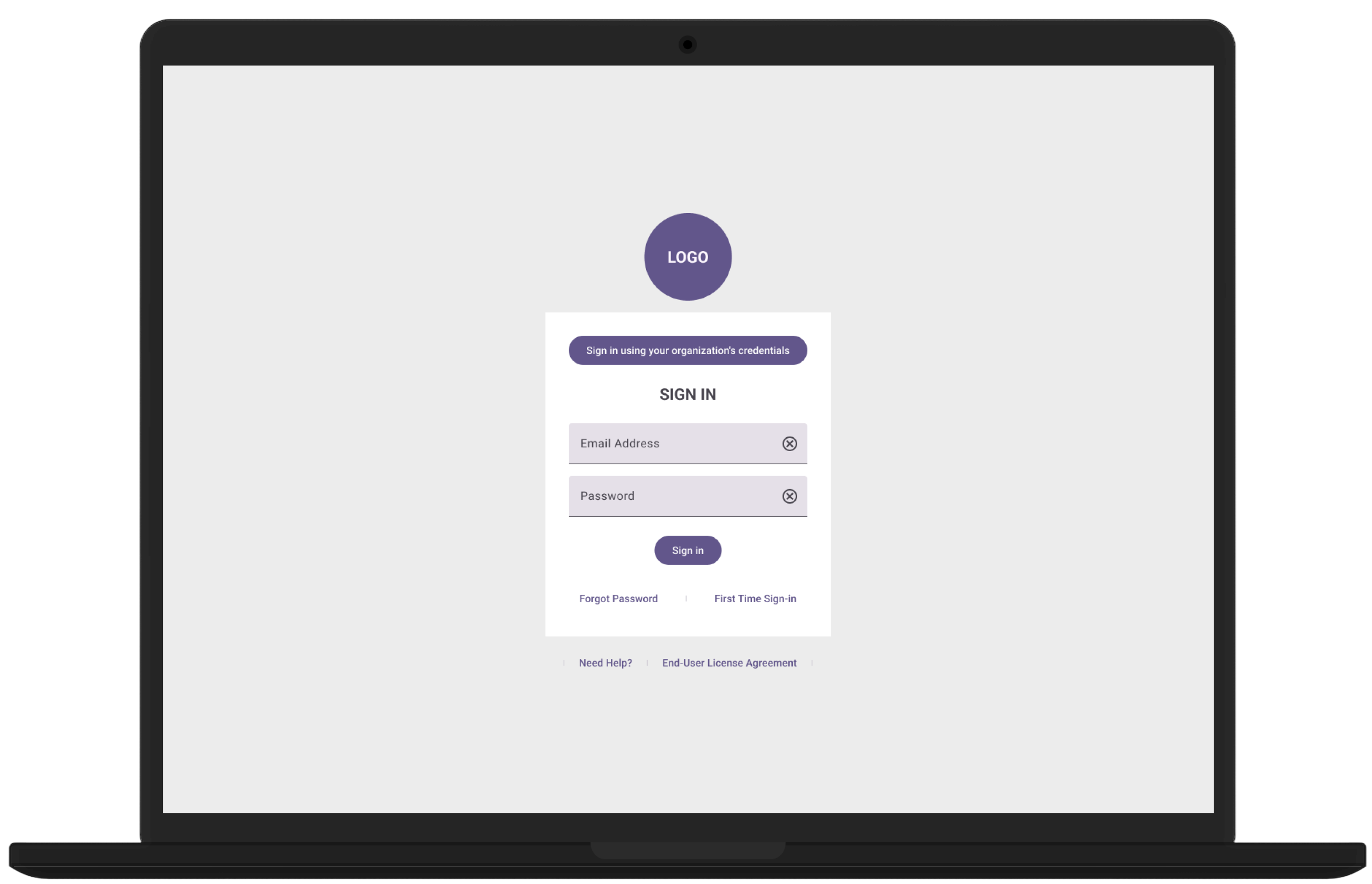
Old
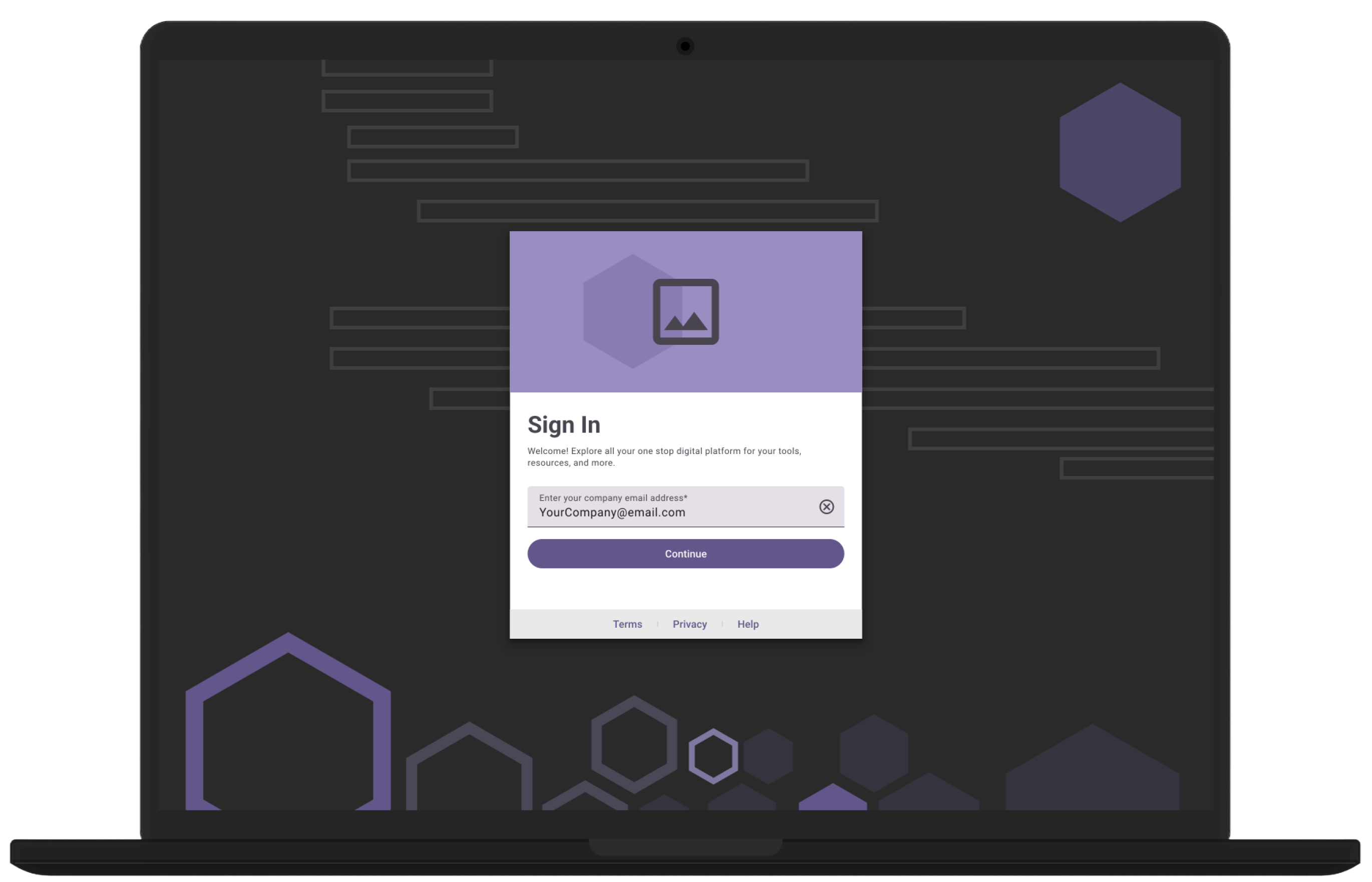
New
Internal users (85%) were supposed to use Single Sign-On, but were mistakenly entering credentials into the wrong fields, triggering dead-end password flows.
The page had too many interaction points and poor visual hierarchy — leading to frustration, login failures, and over 45 seconds average entry time.
I partnered closely with product managers, solution architects, and security teams to ensure our flow met internal access standards.
Through multiple usability passes, we simplified copy, improved auto-fill behavior, and refined error states for a more intuitive experience.
UI Exploration
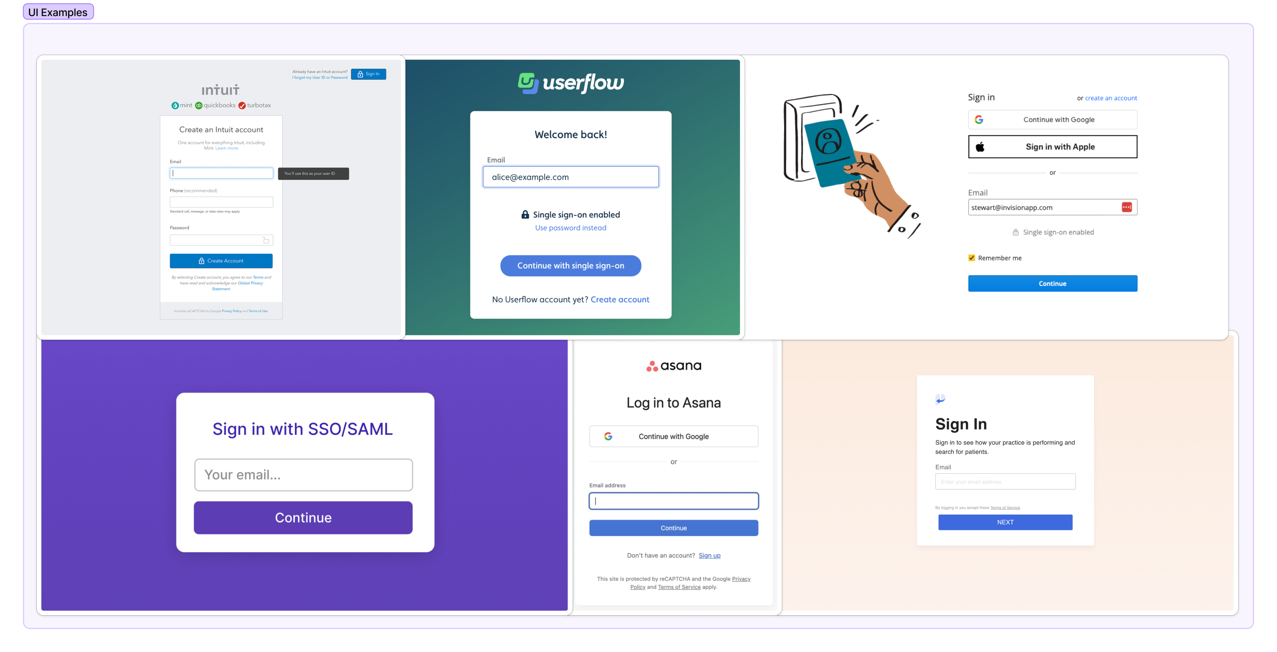
The Approach
Limit User Action
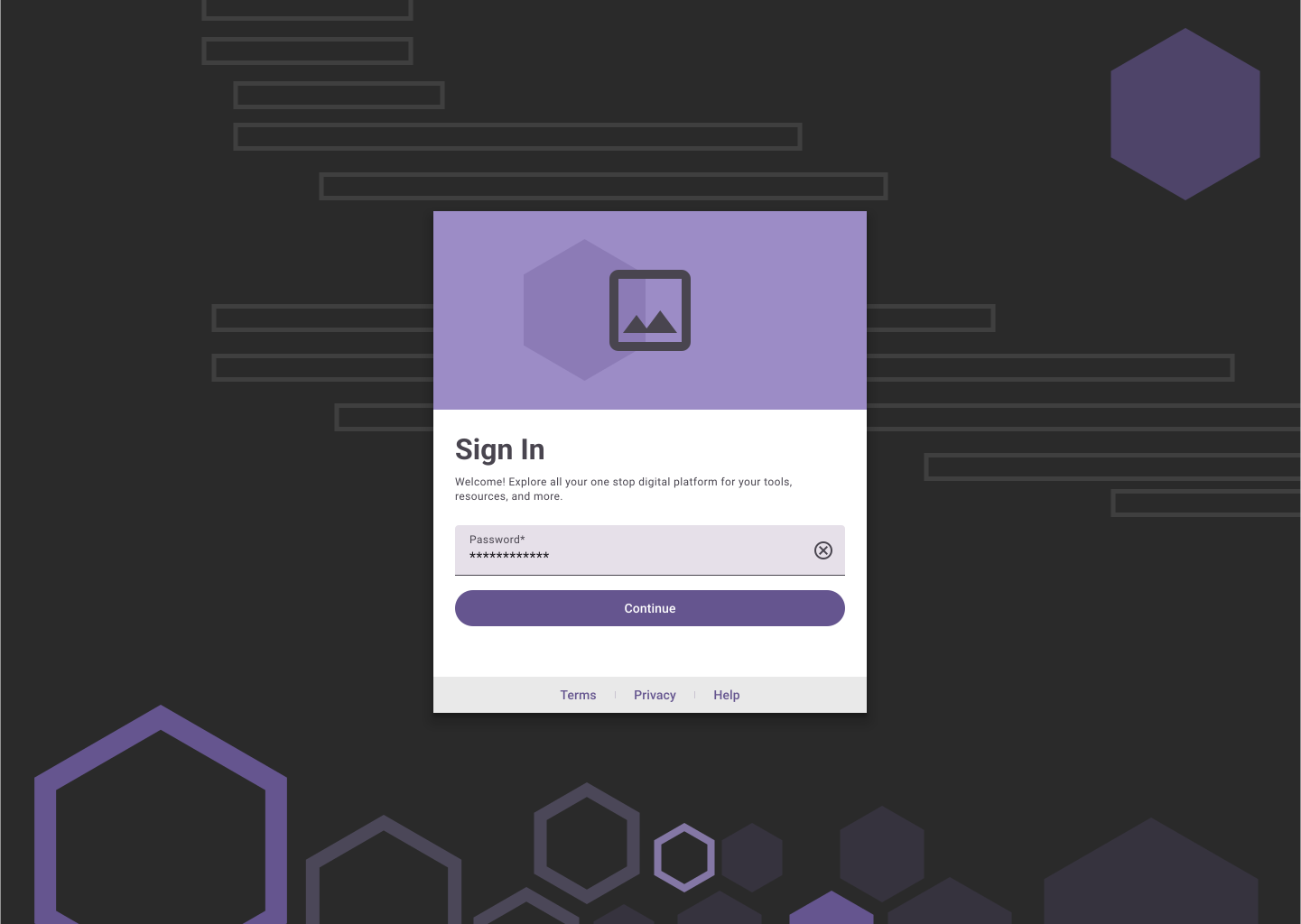
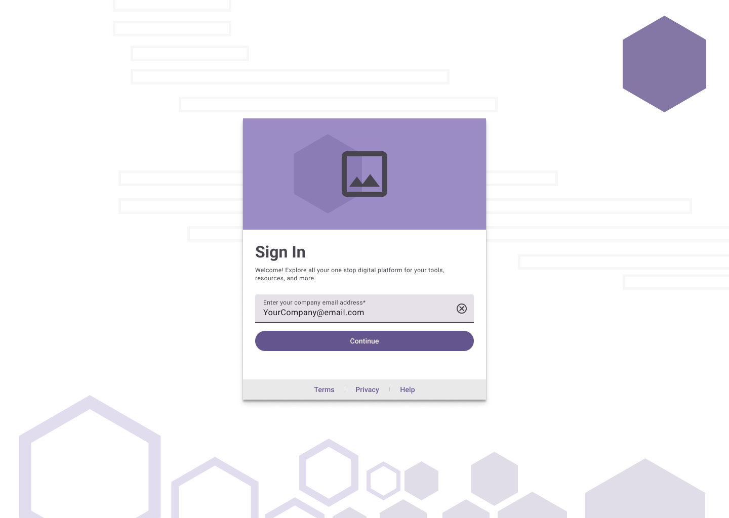
A single input field where the system will validate the user, based on the email they provide.

Remove Passwords
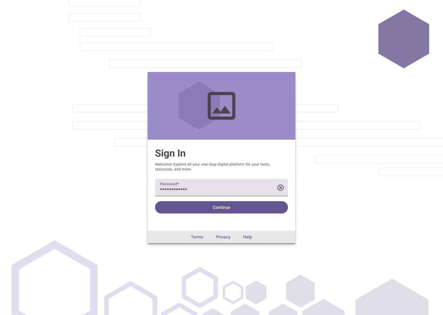
A password less multi-factor authentication removes the burden of having the user remembeR their own credentials.
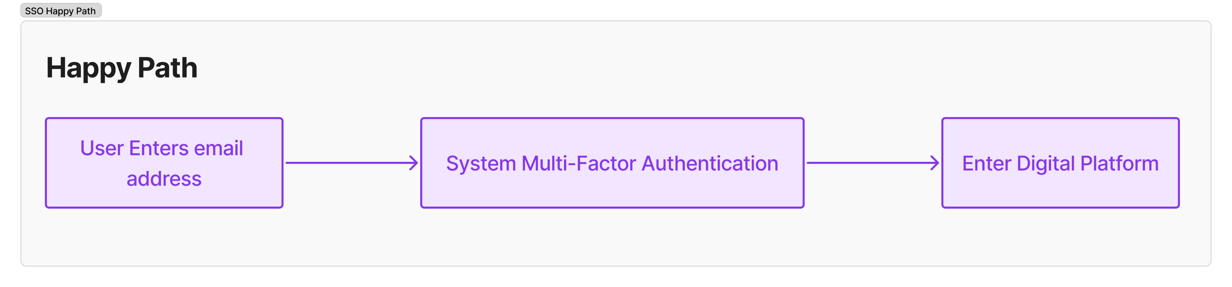
I restructured the entire flow around a single email input field. Once a user enters their email, the system detects their user type and routes them either to SSO or password-based login.
This removed the need for user decision-making, reduced visual clutter, and improved clarity across all devices.
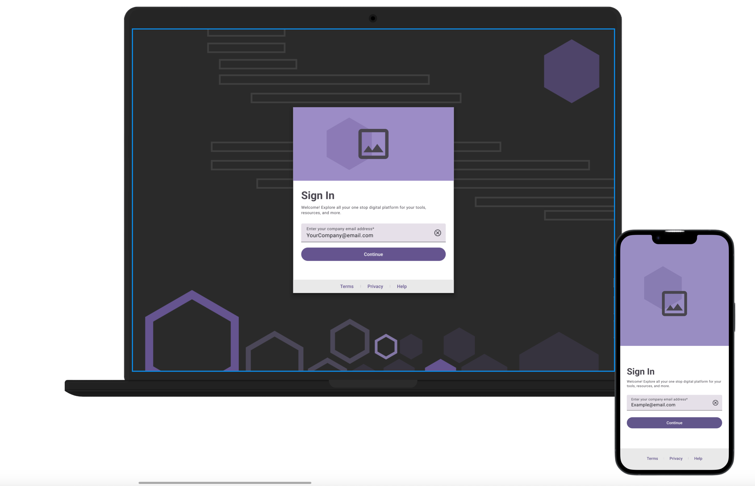
Dark Mode
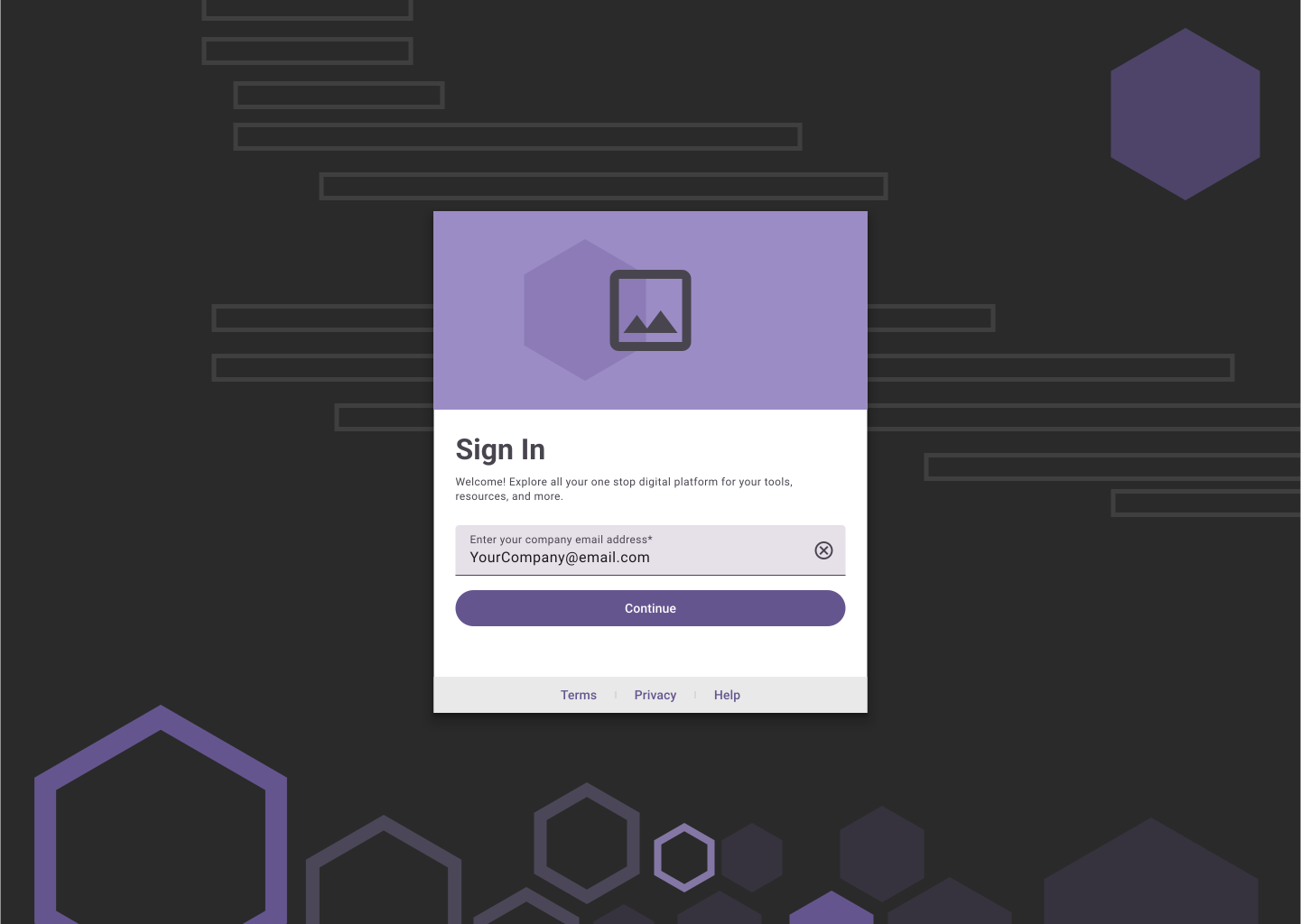
Light Mode
Login times dropped by over 80%, and successful first-attempt sign-ins significantly increased.
Help desk tickets for login issues decreased, and internal users praised the simplicity and ease of the new experience.

Login Time from Start to Finish
- 80%
Succesful First-Time Login attempts
+47%
Reduce Service Desk Tickets
-33%
This project reminded me that even the smallest surface, a single login screen, can carry huge weight.
It’s not just a gateway, it’s a user’s first impression, and when it’s broken, it affects trust, productivity, and perception of the entire platform.
What made this work meaningful wasn’t just simplifying the UI, it was uncovering and fixing the real issue which was removing the burden of decision-making on the user. By shifting that responsibility to the system itself, we removed the guesswork, eliminated dead ends, and turned a daily frustration into a frictionless moment.
It reinforced something I love most about UX: the opportunity to solve real, deeply human problems with systems thinking and clear design. I get energy from untangling complexity and helping people move forward without having to think twice.
That’s the kind of impact I strive to create.
let’s work together!
Built on figma sites
Resume
Authentication Redesign
Streamlining Sign-In: A UX Overhaul for Faster, Easier Access
Role
Lead UX Designer
Company
Factor Mutual Insurance Company
Timeline
October - December
2022
Responsibilities
UX Strategy, User Research, Interaction Design, Cross-Functional Collaboration, Usability Testing
Product
Authentication experience that routes users seamlessly through the login flow.
Team
1 Designer
1 Product Owner
3 Developers
I led the UX redesign of a high-traffic internal sign-in page that was confusing users, increasing login failures, and slowing down access to the portal. My goal was to simplify the experience while accommodating two different user types, without compromising security or clarity.
Old
New
Internal users (85%) were supposed to use Single Sign-On, but were mistakenly entering credentials into the wrong fields, triggering dead-end password flows.
The page had too many interaction points and poor visual hierarchy — leading to frustration, login failures, and over 45 seconds average entry time.
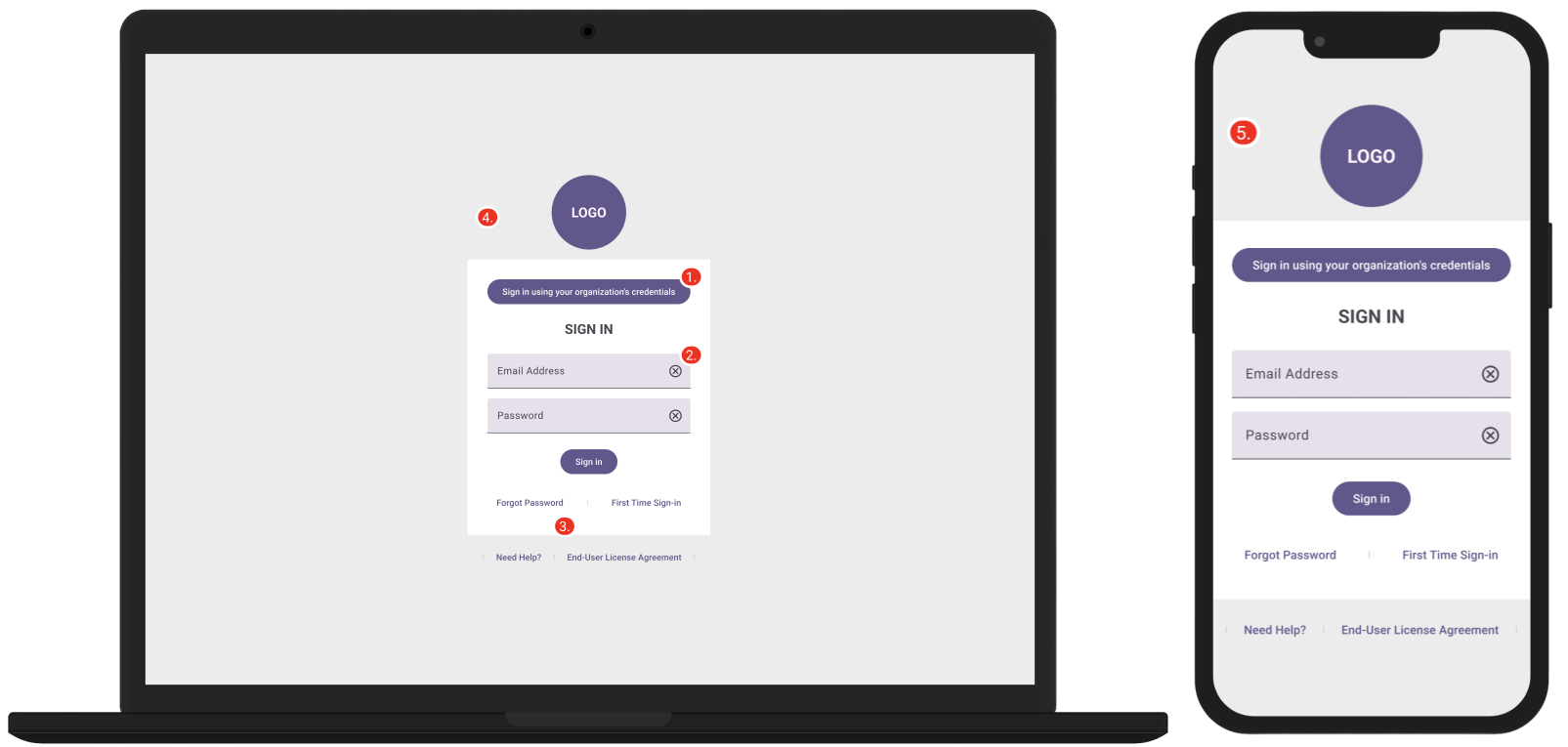
1.
Single Sign On (SSO) button has too many words, was often overlooked and was not intuitive for the majority of users who needed to be using it.
2.
Email / Password Combination took up to much real estate giving users the impression that this was their primary way of logging in
3.
“Forgot Password”, “First Time Sign-in”, and “Need Help?” gave the users too many options and ways to further get lost in the flow if they mistakenly entered false credentials.
4.A
Absence of clear and engaging copy created confusion and frustration.
4.B
Bland background detracted from desired warm, inviting, and modern aesthetic.
5.
Mobile responsiveness was too literal and could have a better layout.
I partnered closely with product managers, solution architects, and security teams to ensure our flow met internal access standards.
Through multiple usability passes, we simplified copy, improved auto-fill behavior, and refined error states for a more intuitive experience.
UI Exploration
The Approach
Limit User Action
A single input field where the system will validate the user, based on the email they provide.
Remove Passwords
A password less multi-factor authentication removes the burden of having the user remembeR their own credentials.
I restructured the entire flow around a single email input field. Once a user enters their email, the system detects their user type and routes them either to SSO or password-based login.
This removed the need for user decision-making, reduced visual clutter, and improved clarity across all devices.
Dark Mode
Light Mode
Login times dropped by over 80%, and successful first-attempt sign-ins significantly increased.
Help desk tickets for login issues decreased, and internal users praised the simplicity and ease of the new experience.
Login Time from Start to Finish
- 80%
Succesful First-Time Login attempts
+47%
Reduce Service Desk Tickets
-33%
This project reminded me that even the smallest surface, a single login screen, can carry huge weight.
It’s not just a gateway, it’s a user’s first impression, and when it’s broken, it affects trust, productivity, and perception of the entire platform.
What made this work meaningful wasn’t just simplifying the UI, it was uncovering and fixing the real issue which was removing the burden of decision-making on the user. By shifting that responsibility to the system itself, we removed the guesswork, eliminated dead ends, and turned a daily frustration into a frictionless moment.
It reinforced something I love most about UX: the opportunity to solve real, deeply human problems with systems thinking and clear design. I get energy from untangling complexity and helping people move forward without having to think twice.
That’s the kind of impact I strive to create.
let’s work together!
Built on figma sites
Resume
Authentication Redesign
Streamlining Sign-In: A UX Overhaul for Faster, Easier Access
Role
Lead UX Designer
Company
Factor Mutual Insurance Company
Timeline
October - December
2022
Responsibilities
UX Strategy, User Research, Interaction Design, Cross-Functional Collaboration, Usability Testing
Product
Authentication experience that routes users seamlessly through the login flow.
Team
1 Designer
1 Product Owner
3 Developers
I led the UX redesign of a high-traffic internal sign-in page that was confusing users, increasing login failures, and slowing down access to the portal. My goal was to simplify the experience while accommodating two different user types, without compromising security or clarity.
Old
New
Internal users (85%) were supposed to use Single Sign-On, but were mistakenly entering credentials into the wrong fields, triggering dead-end password flows.
The page had too many interaction points and poor visual hierarchy — leading to frustration, login failures, and over 45 seconds average entry time.
1.
Single Sign On (SSO) button has too many words, was often overlooked and was not intuitive for the majority of users who needed to be using it.
2.
Email / Password Combination took up to much real estate giving users the impression that this was their primary way of logging in
3.
“Forgot Password”, “First Time Sign-in”, and “Need Help?” gave the users too many options and ways to further get lost in the flow if they mistakenly entered false credentials.
4.A
Absence of clear and engaging copy created confusion and frustration.
4.B
Bland background detracted from desired warm, inviting, and modern aesthetic.
5.
Mobile responsiveness was too literal and could have a better layout.
I partnered closely with product managers, solution architects, and security teams to ensure our flow met internal access standards.
Through multiple usability passes, we simplified copy, improved auto-fill behavior, and refined error states for a more intuitive experience.
UI Exploration
The Approach
Limit User Action
A single input field where the system will validate the user, based on the email they provide.
Remove Passwords
A password less multi-factor authentication removes the burden of having the user remembeR their own credentials.
I restructured the entire flow around a single email input field. Once a user enters their email, the system detects their user type and routes them either to SSO or password-based login.
This removed the need for user decision-making, reduced visual clutter, and improved clarity across all devices.
Dark Mode
Light Mode
Login times dropped by over 80%, and successful first-attempt sign-ins significantly increased.
Help desk tickets for login issues decreased, and internal users praised the simplicity and ease of the new experience.
Login Time from Start to Finish
- 80%
Successful First-Time Login attempts
+47%
Reduce Service Desk Tickets
-33%
This project reminded me that even the smallest surface, a single login screen, can carry huge weight.
It’s not just a gateway, it’s a user’s first impression, and when it’s broken, it affects trust, productivity, and perception of the entire platform.
What made this work meaningful wasn’t just simplifying the UI, it was uncovering and fixing the real issue which was removing the burden of decision-making on the user. By shifting that responsibility to the system itself, we removed the guesswork, eliminated dead ends, and turned a daily frustration into a frictionless moment.
It reinforced something I love most about UX: the opportunity to solve real, deeply human problems with systems thinking and clear design. I get energy from untangling complexity and helping people move forward without having to think twice.
That’s the kind of impact I strive to create.
let’s work together!
Built on figma sites
Resume